
The Urban Institute released its monthly chartbook today, which provides tons of data about the mortgage market.
As I scanned through it, I came across three charts I felt kind of summed up where we’re at in the current housing cycle, and why despite high home prices relative to a few years ago, we are still OK.
The first two charts display mortgage origination by product type, broken down into four categories:
– 30-year fixed mortgage
– 15-year fixed mortgage
– Adjustable-rate mortgage
– Other
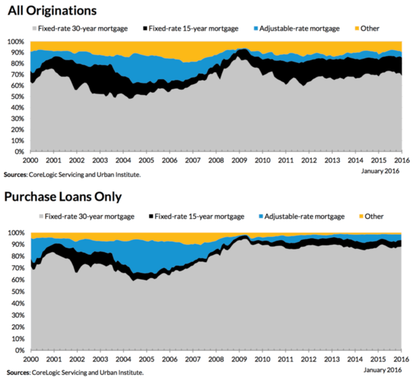
- Look at how many mortgages are fixed as opposed to adjustable
- That is telling of the quality of today’s mortgages
- It’s certainly not everything though
- We also have to consider things like down payment, job market, etc.
Both charts show the mortgage product mix since the year 2000, with the second chart displaying purchase activity only.
As you can see, the bulk of mortgages continue to be fixed mortgages, with 15-year fixed mortgages also quite strong.
The super low mortgage rates available have pushed borrowers to refinance into shorter term mortgages like the 15-year and even the 10-year fixed, which is great news for the housing market.
Even if it’s not in their best interest, it means homeowners today are amassing a whole lot of skin in the game. With each monthly payment, borrowers are accruing more and more equity, putting them in a less levered position and easing concerns if home prices drop.
Meanwhile, those with a standard 30-year fixed are building equity too, albeit it at a slower pace, but at least their making payments to principal each month. Some 88% of home buyers in January went with the 30-year fixed.
During the years preceding the housing crisis, many borrowers were either making interest-only payments, or worse, a negative amortization payment that wasn’t even enough to cover interest. This meant that crop of homeowners had nothing invested in the housing market.
The adjustable-rate mortgage share at this time was as high as 27%, compared to around 5% today.
If and when home prices went down, these borrowers chose to simply walk away or sell short because they had no equity to protect or care about.
When viewing these charts, I’ll start to worry again when the mix is more ARM-heavy, or perhaps more interest-only heavy, assuming non-QM lending takes off at some point once affordability fades.
At the moment, the product mix looks really good, even if home prices have risen substantially. Coupled with low mortgage rates, it means today’s homeowner is heavily invested in their property, which is good for neighborhoods nationwide.
Even those who stayed in their homes despite the crisis several years ago are doing pretty well. Many are no longer in underwater positions, and plenty of them have refinanced their mortgages to new lower rates.
A Home Purchase Is Still Affordable
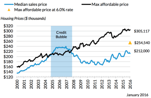
- Despite recent home price increases
- The median home is still affordable to most buyers
- And there is room for prices to rise even higher
- But pay attention to rising rates and local markets that might become overheated
Now let’s look at a third chart, this one concerning housing affordability. As noted, home prices have risen tremendously in recent years.
However, home prices remain affordable to most. In fact, even if mortgage rates increased more than two percentage points from current levels to 6%, they’d be affordable to a buyer putting down 20% who earns the median household income.
The national median sales price is around $212,000…it could rise nearly another $100,000 to $305,117 before becoming unaffordable. That number is roughly halved if mortgage rates rise to 6%.
Yes, it depends on the housing market in question. Some parts of the country are already unaffordable with mortgage rates near record lows. Others remain very affordable.
Just look at where the median sales price was during the credit bubble relative to the maximum affordable price. From 2005 through 2007, it exceeded that max amount, and the only reason it was able to sustain for the period it did was because of shoddy mortgages.
Those mortgages aren’t available today, nor are they necessary at the moment because rates are low and home prices have yet to fully recover.
The point here is that the mortgage market is a lot healthier this time around, so a full-blown crisis will probably take a while to materialize.
It’s not to say it won’t, because we all know real estate cycles up and down, but we may have more time (and upside) than we realize, especially with so few homes available to purchase.
Read more: How much mortgage can I afford?