


One of the things prospective home buyers and existing homeowners seem to care most about is mortgage rates.
And for good reason – the interest rate you receive on your home loan determines what you’ll pay each month, sometimes for as long as the next 30 years. That’s 360 months until the year 2054!
The rate you receive can also completely make or break your home purchase, or sway the decision to refinance a mortgage.
As such, I decided it would be prudent (and helpful) to create a “mortgage rate chart” that displays the difference in monthly mortgage payment across a variety of interest rates and loan amounts.
This is especially important now that mortgage rates have bounced off record lows and are nearing 8%, the highest levels since the year 2000.
30-Year Mortgage Rates Chart
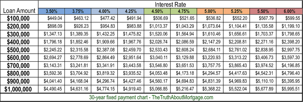
- Use the 30-year mortgage rates chart above to quickly ballpark monthly principal and interest payments
- You can easily see different monthly P&I payments at various interest rates and loan amounts
- And if it’s worth paying discount points at closing for an even lower rate
- While the chart is handy for estimates, don’t forget to include the taxes and insurance!
My original mortgage rate chart above highlights monthly payments at different rates for 30-year mortgages, with loan amounts ranging from $100,000 to $1 million.
I went with a bottom of 3.5%, seeing that mortgage interest rates were around that level when I created the chart, and generally don’t seem to go any lower than that.
There is certainly the possibility that fixed rates could drift back to the levels on this chart with all the geopolitical uncertainty and COVID still shaking out.
And one might be able to buy their rate down to these prices, or snag a special buydown deal from a home builder in this range.
For the high-end, I set interest rates at 6%, which is where 30-year fixed mortgage rates were for many years leading up to the mortgage crisis in the early 2000s. But times have changed.
My New Chart Goes Up to 9% Mortgage Rates Because, Well, You Know…
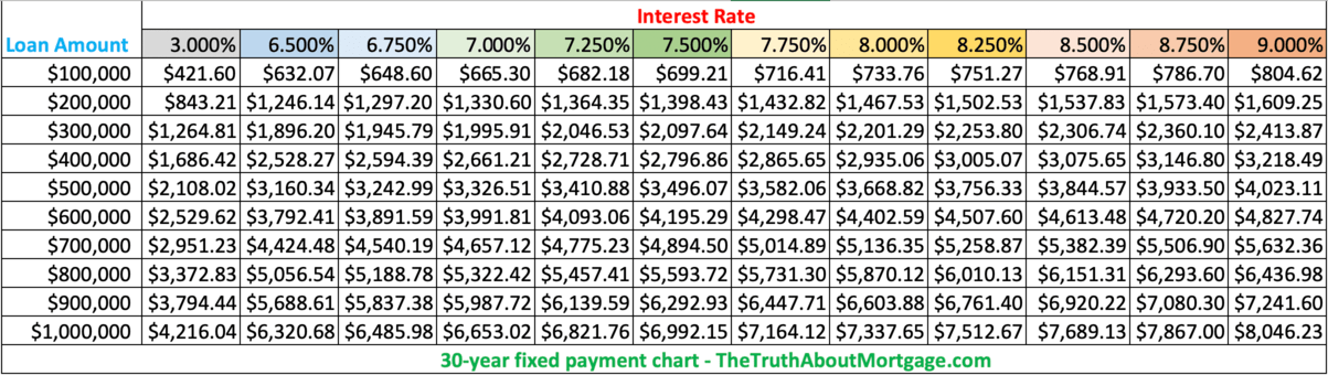
I hoped they wouldn’t return there anytime soon…they have now surpassed those levels and in quick order. Yikes!
That led me to create my latest version of the chart, with mortgage rates up to 9%. Yes, 9%. I thought about going to 10%, but put my foot down.
Sure, they could rise even higher over time depending on what transpires in the economy and mortgage market, but hopefully home loan rates don’t climb back to the double-digits last seen in February 1990.
That fear aside, this mortgage payment chart should give you a quick idea of the difference in monthly payments across a range of mortgage rates and loan amounts.
I kept the 3% mortgage rates in there for reference to see just how much monthly principal and interest payments have risen. It’s pretty brutal given the short timeline from 3% to now around 8%. Less than two years!
Anyway, this should save you some time fooling around with a mortgage calculator.
It should also make your job easier when you compare rates from different lenders. Or when you compare your current mortgage rate to what’s being offered today.
My Expanded Mortgage Rate Charts
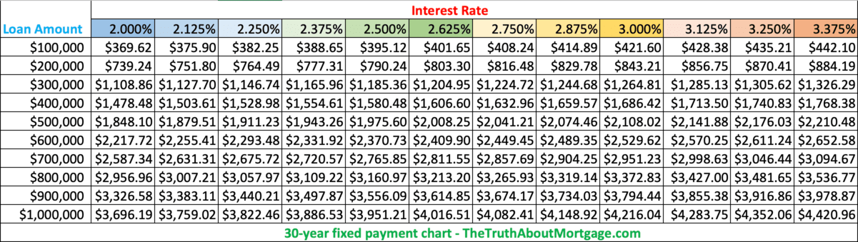
- I created two additional mortgage rate charts that factor in the record low rates (which have now vanished)
- And the possibility of them drifting even lower over coming months and years (it’s possible!)
- The charts are more granular because rates are broken down by eighths as opposed to quarters
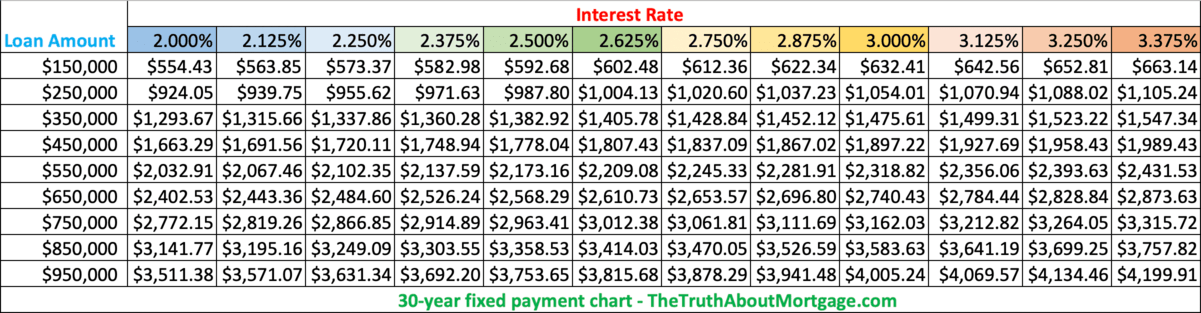
- Also available in 50k increments if your loan amount is closer to that
These charts can make it quick and easy to compare rate quotes from mortgage lenders, or to see the impact of a daily rate change in no time at all.
After all, mortgage rate updates can happen frequently, both daily and intraday. And rates are especially erratic at the moment.
So if you were quoted a rate of 3.5% on your 30-year fixed mortgage two weeks ago, but have now been told your home loan rate is closer to 4%, you can see what the difference in monthly payment might be, depending on your ballpark loan amount.
This is pretty important when purchasing real estate or seeking out a mortgage refinance, as a significant jump in monthly mortgage payment could mean the difference between a loan approval and a flat out denial.
Or you might be stuck buying less house. Or perhaps driving until you qualify!
These Charts Work for Adjustable-Rate Mortgages Too!
For the record, you can use the 30-year charts above for adjustable-rate mortgages too because they’re based on the same 30-year loan term. They just don’t offer fixed rates beyond the initial teaser rate offered.
So if you’re looking at a 5/1 ARM, you can still use those charts. Just know that your interest rate will adjust after those first five years are up, and the chart will no longer do you any good.
That is, unless you’re looking to refinance your mortgage to a new low rate to avoid the interest rate adjustment.
Tip: Use the charts to quickly determine the impact of a higher or lower credit score on rates. If you’re told you can get a rate of 4% with a 760 credit score or a rate of 4.5% with a 660 score, you’ll know how much marginal or bad credit can really cost.
15-Year Mortgage Rates Chart
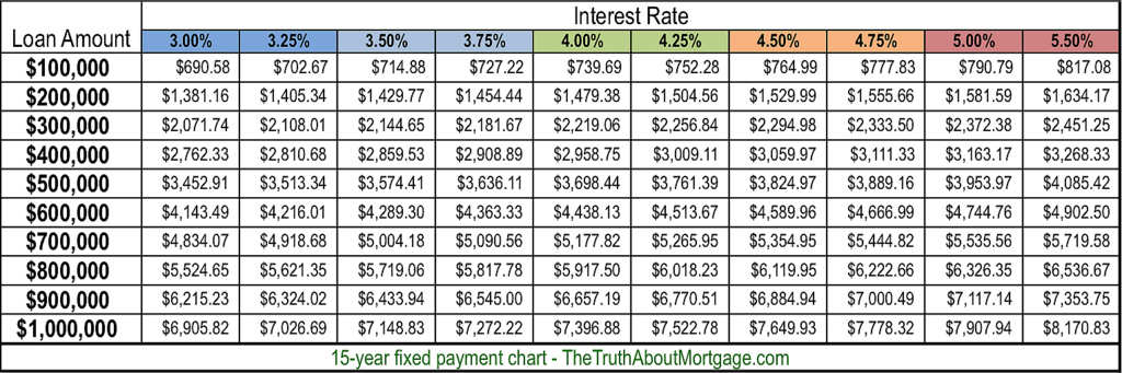
- The 15-year mortgage rates chart helps illustrate the massive cost difference of a shorter-term mortgage relative to a 30-year mortgage
- Use it to determine the capability of making larger monthly payments at various loan amounts
- And also to see if refinancing makes sense at certain interest rates
- While payments are significantly higher, you can save a ton of money on interest and pay off your home loan in half the time
Now let’s take a look at my mortgage rates chart for 15-year fixed mortgages, which are also fairly popular, but a lot less affordable.
I used a floor of 3% and a max rate of 5.50%. Again, rates can and probably will climb higher, just hopefully not anytime soon.
For the record, you can obtain mortgage rates at every eighth of a percent, so it’s also possible to get a rate of 3.625%, 3.875%, 4.125%, 4.375%, and so on.
But for the sake of simplicity, I spaced it every quarter of a percent except for the jump from 5% to 5.5%.
These charts are really just a quick reference guide to get ballpark monthly mortgage payment amounts if you’re beginning to dip your toes in the real estate pool.
If you’re getting serious about home buying or looking to refinance an existing mortgage, whip out a loan calculator to get the exact PITI payment.
Some Interesting Takeaways from the Mortgage Rate Charts
- Monthly payment differences grow larger when interest rates are higher
- Higher mortgage rates may be worse than larger loan amounts in some cases
- Small loan amounts are less affected by interest rate movement
- Those with smaller loan amounts have a higher likelihood of affording 15-year payments
The lower the interest rate, the smaller the difference in monthly payment. As rates move higher, the difference in payment becomes more substantial.
Something to consider if you’re looking to pay mortgage discount points to determine if it’s actually worth the cost.
If you look at the 30-year mortgage rate chart, the monthly payment difference on a $500,000 loan amount between a rate of 3.5% and 3.75% is $70.36, compared to a difference of $77.93 for a rate of 5.25% vs. 5.5%.
Additionally, higher mortgage rates can be more damaging than larger loan amounts.
Again, using the 30-year mortgage rates chart, the payment on a $400,000 loan amount at 3.50% is actually cheaper than the payment on a $300,000 loan at 6%.
So you can see where an individual who purchases a home while mortgage rates are super low can actually enjoy a lower mortgage payment than someone who buys when home prices are lower.
However, for someone purchasing a really expensive home, upward interest rate movement will hurt them more than someone purchasing a cheaper home.
Sure, it’s somewhat relative, but it can be a one-two punch for the individual already stretched buying the luxury home.
To illustrate, the difference between a rate of 5% and 5.25% for loan amounts of $300,000 and $900,000 is about $46 vs. $138, respectively.
Be Sure to Look at the Big (Payment) Picture
- Most advertised mortgage payments only include principal and interest
- There is a lot more that goes into a monthly housing payment
- Including property taxes, homeowners insurance, HOA dues, PMI, and so on
- Don’t buy more home than you can afford without considering all of these items
Lastly, note that my mortgage payment graphs only list the principal and interest portion of the loan payment.
You may also be subject to paying mortgage insurance and/or impounds each month. Property taxes and homeowner’s insurance are also NOT included.
You’ll probably look at this chart and say, “Hey, I can get a much bigger mortgage than I thought.”
But beware, once all the other costs are factored in, your DTI ratio will probably come under attack, so tread cautiously.
And don’t forget all the maintenance and utilities that go into homeownership. Once you hire a gardener, pool guy, and run your A/C and/or heater nonstop, the costs might spiral out of control.
I referenced this problem in another post that focused on if mortgage calculators were accurate, in which I found that housing payments are often greatly underestimated.
So you might want to drop your loan amount by $100,000 if you think you can just get by, as those other costs will certainly play a role.
And with the housing market so competitive today, you may want to lower your max purchase price in apps like Redfin and Zillow too, knowing the final sales price will likely be above asking.
Oh, and if you want to nerd out a little bit (a lot), learn how mortgages are calculated using real math, not some fancy calculator that does it all for you.
Or just use my mortgage payment calculator and enjoy the simplicity of it all. The choice is yours.

- Are Mortgage Rates Finally Poised to Start Falling Again? - June 25, 2026
- Mortgage Rates Are Having a Good Day as Oil Prices Fall to Pre-War Levels - June 24, 2026
- You Can Still Get a Sub-6% Mortgage Rate, But Is It Worth It? - June 23, 2026